Finally it’s here!!!
Well…the post anyway, I’ve had my new planner for like two weeks already. I just hadn’t had the time to do a full post on it that would do my love of it justice.
We know I love everything Erin Condren, all you have to do is search my blog to see how many posts I’ve made about her products. They are my holy grail of planners, I have yet to find anything that works as well for me and my life than these.
If you’ve followed me for awhile. you know that I typically have 2 Erin Condren planners with me; an Erin Condren vertical style planner for personal stuff and an Erin Condren hourly style planner for my work stuff. I’ve tried just doing one before but it’s just too much and my planner usually becomes more jumbled and confusing and definitely not helpful.
The hourly, I’ve found is the best for me because of the times listed in the planner. The vertical could work, but a lot of my day is situated around what time I need to be places or meetings that take place at a certain time, so having the times listed and having it being broken down by half hour increments, really keeps me the most organized.
One of the reasons I love Erin Condren’s products so much is because she really takes the time to listen to her consumers and understand their needs. Every year there is some sort of change to the layout of the planner or the binding or something to help improve quality and enjoyment of the planners. If you remember my previous post, I mentioned that this year, not only do they have their signature coiled planners, but they now also offer hardbound planners, so there is a new option for those that really dislike the coil aspect.
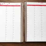
Along with adding new designs, they also upgraded their paper in all of their planners. One critique I saw a lot in previous years was that the paper was thinner than most would have liked and people had issues with their writing bleeding through the pages. This year, Erin Condren teamed up with Mohawk papers to give a boost to their paper quality. Compared to previous years, they now use paper that has an 80lb text weight for the planner pages and a heavy cardstock for the monthly pages. They guarantee that users will not have issues with bleed through from thicker pens or heavier hands. And let me tell you, the paper feels amazing! If you caught my Instastory when I opened the planner you heard how thick it was just as I was thumbing through it; it’s thicker but not grainy so it will make for an amazing writing surface.
There have also been a few other design updates to the planners that I’ll talk about as we look through the planner, which makes them even more functional and will help everyone get the most use out of the planner.
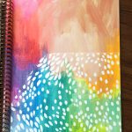
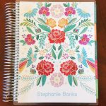
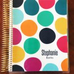
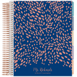
Obviously, I went with the coiled planner. I’m not a big fan of hardbound, I like that I can flip my planner and have it all set to one side when I need it. Plus, I love the rose gold coil I selected. Also, if you remember, I chose the cover that kind of matches my wedding colors because…ya know…I’m excited to get married and all. It’s also the last work planner I’ll have with my maiden name on it…..yeah…I’m that dorky.
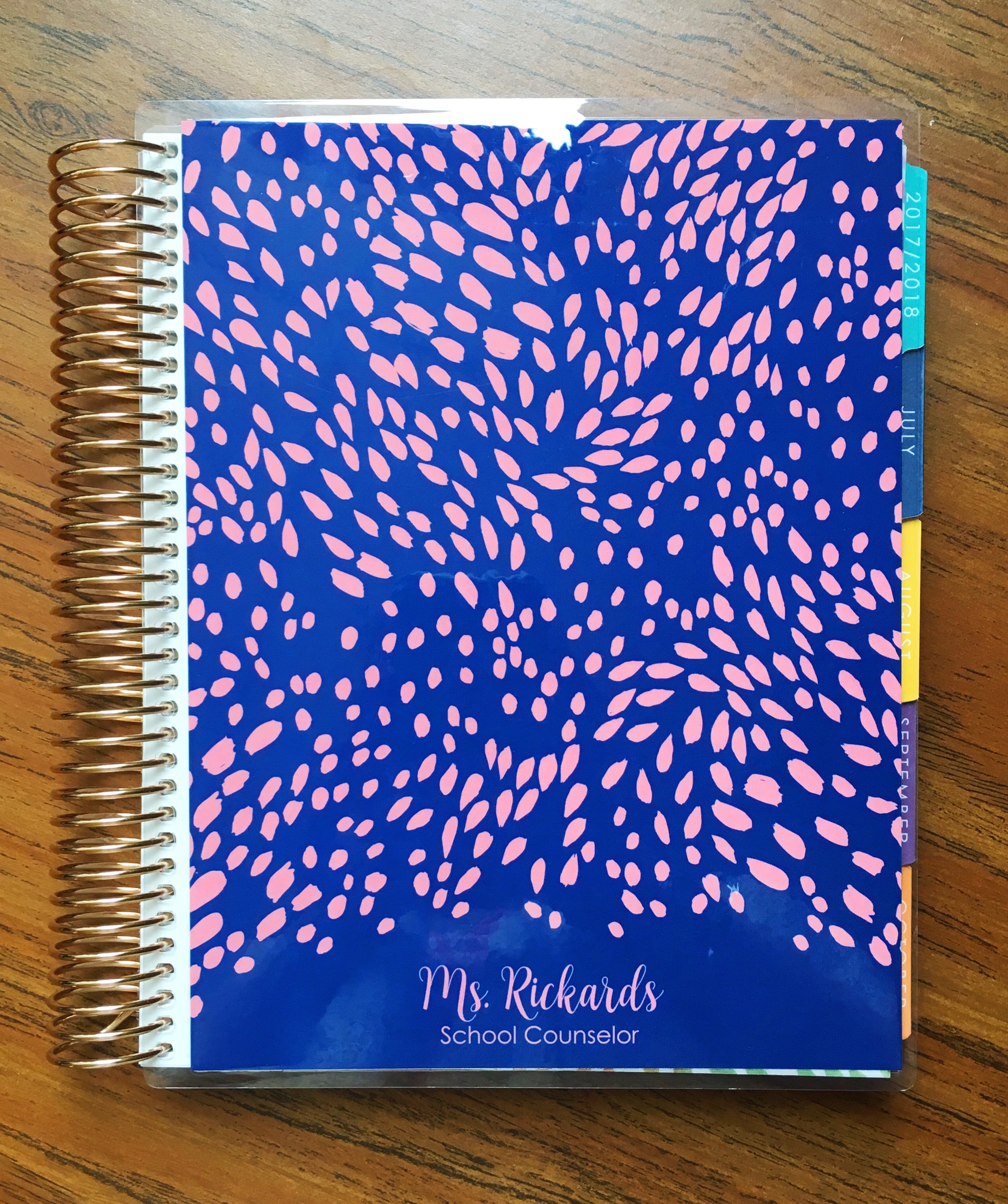
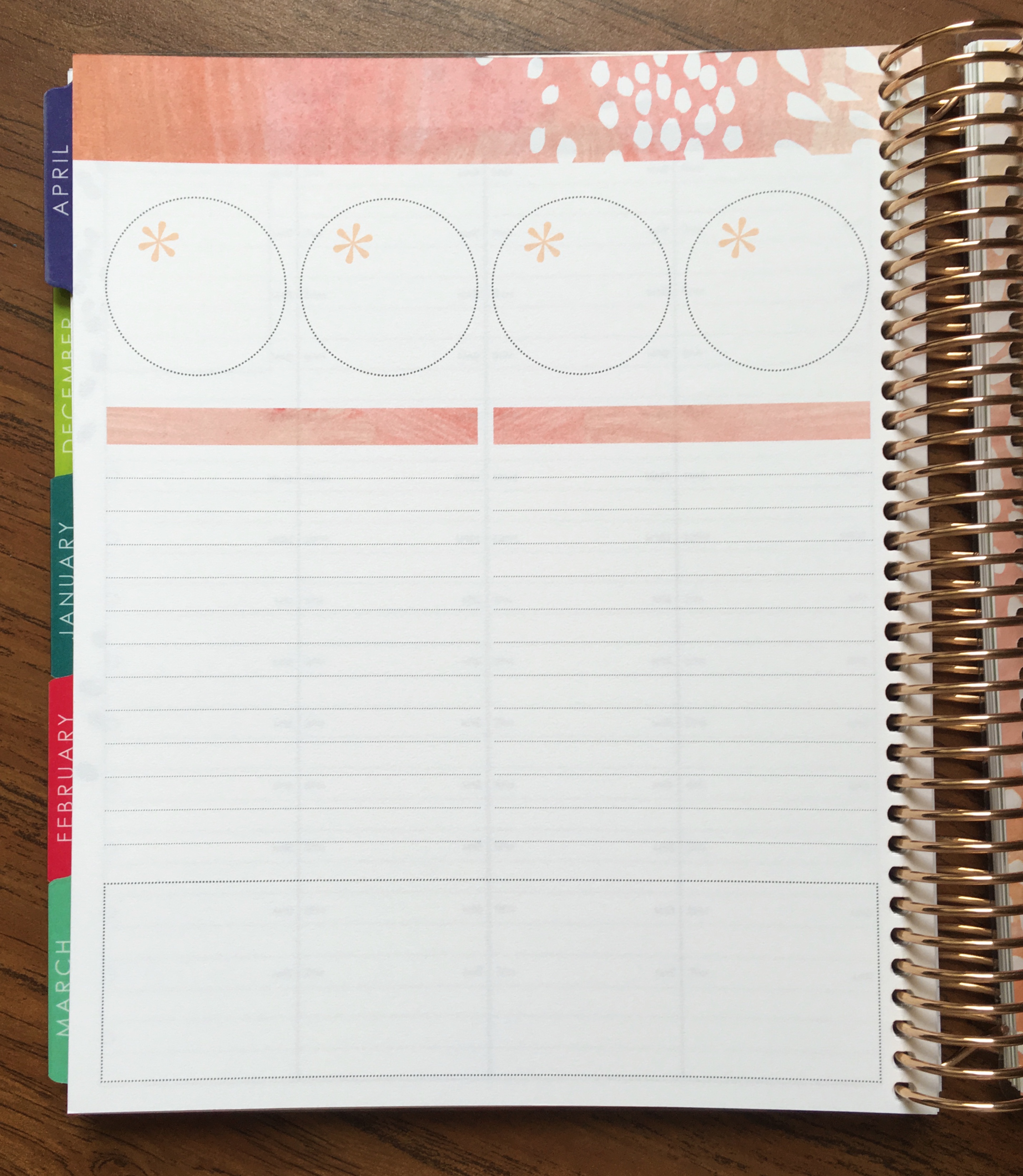
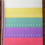
The very beginning of the planner hasn’t changed that much, it still has the vellum cover over the title page. However, they have changed the “goals” page to just have boxes, so you can now track whatever you need to, however you need to. I’m not entirely sure what I’m going to use this page for yet, but I do like the changes!
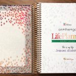
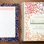
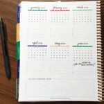
With this new planner, they changed up the fonts and color scheme a bit, which I really love. The colors seem more vibrant but still in a muted color scheme. So you’re not going to see any blinding yellow or bright red, but the colors are rich and really well done. I also really like the script font, it just makes everything feel a little fancier.

At the end of each month there is always a notes page. I typically, in my work planner, use it for our monthly faculty meetings to jot down notes. However, the notes page has changed so I don’t think I’ll be able to use it for that anymore. I’m honestly not sure what I’ll use it for yet. I like the idea behind the change, but not sure what practical use I’ll have for it yet.
There is also a notes section in the back, which hasn’t changed much. I always like to keep these sections for master lists and tasks that I need to track throughout the school year. The only real difference to this section this year is that instead of blank paper, they have jumped on the coloring bandwagon by adding in a few coloring pages. As a counselor, I don’t mind this at all. I’m a huge advocate of coloring as a stress-relieving activity and now I have a few pages always in my hand if I need a moment to calm down.


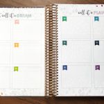
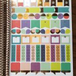
One of the biggest changes, and one of the ones I’m most excited about (and let’s be fair I’m excited about all of it) are the new sticker pages in the back! If you’ve seen previous planner posts of mine or had an Erin Condren planner before, you know that they always come with four sheets of planner stickers. They were all pretty much the same shape and size, some of them were blank, some had special events on them.
Well this year, they took a huge note from their fanbase and upped their sticker game! Not only do they have gold foiled stickers, but they have them in a bunch of different shapes and sizes; they have boxes to write on, icons to just have something pop out at you in your planner, checklists, headers, etc. They do still have a couple pages of their “normal” stickers as well and even those got a facelift with asterisks and some white space on them to make them easier to read in your planner. The new stickers are SO pretty, I cannot wait to get into those!
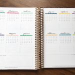
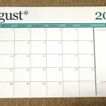
For the most part, the rest of the planner is pretty much the same as years past. You still have the back pocket, which has come in handy so many times for random papers this year. The next year’s calendar is also back there, which for me is so helpful for planning events for the next school year so that I can see what falls where and there is room to write down events I’ll need to remember and transfer to a new planner.

I did a side-by-side comparison of my current hourly planner and my new one for next year. My current planner is an 18 month planner (since that was the only option last year) and my new one is a 12 academic month planner. Both the coils are about the same size, which is great because if you look closely, you’ll see that if I had to finish out through December in my current planner, my cover would probably pop off. So I should have plenty of room with this only being 12 month.


I also wrote in the planner just a little to get a feel for the new paper and it feels AMAZING! It’s so smooth to write on and nothing bleeds to the other side. The paper quality is unbelievably awesome. And yeah, you can see again from what I wrote…..I’m getting married and just a little bit excited about it.

(And not to confuse anyone, that “4 year anniversary” will now be our dating anniversary…just throwing that out there.)
I am so excited to really get to use this in July and really test out all the new fun features and parts of this planner. If you’re interested in checking out a planner for yourself, feel free to go through this link that will save you an extra $10 off your order! You can also feel free to check out the “Erin Condren” category here on my blog if you want to see some of my other planners and accessories I use from Erin Condren (just don’t laugh at my obsession).
Happy planning!!
Did not get my celebrate someone every day book with it …