So, I think at this point, it’s obvious that I love Erin Condren Planners. You can just search Erin Condren on my blog and find so many posts about my mini-obsession.
Last year, if you remember, I used an Erin Condren Teacher Planner for this school year, which worked pretty well. If there wasn’t confidential information in there, I would show you, but I don’t want to put any info out there that shouldn’t be. But, it did work really well, but there were some things that I maybe didn’t use as much as I thought I would; some sections were kind of pointless and went unused, etc.
Erin Condren came out with the hourly version at the start of 2016 and as this school year has gone by, I thought that an Hourly layout, might actually be a better alternative to the Teacher Planner. Especially with my semi-new role in the department, I’m going to have a lot more meetings and be a bit more time-crunched, it seems like laying my day out by hours might keep me the most organized.
The irony of this though, is that I’m actually going to be teaching Seminar classes next year. I do them every year, but next year I will be doing them throughout the whole year as opposed to just a marking period like I did this year and last. So, a lesson planner might be logical…but…..I have another system for that this coming year. So it’s not that big of a deal to me.
I’m still sort of playing around with how I’ll use the hourly for school and working on some mock-ups because I’ve had a few people ask how a counselor can use an hourly planner. And it seems like it can work really well, but I’ll do a separate post on that once I’ve played around with the planner and fully gotten a feel of how I’ll use it. So for this, I just wanted to give an overview of the hourly for those that might be interested.
I love the changes that Erin Condren’s team have made to this year’s line-up. They really listened to their customers and made some amazing changes to the paper quality (which is better and AMAZING) and features and the fact that you can personalize it in so many ways.
If you go on the Erin Condren website, under Life Planners, you can build whatever system you want. You can choose coil colors (they have platinum, gold, rose gold, and even a black color now), what kind of cover you want, whether or not you want a colorful planner or a neutral (very black and white) planner, and what kind of layout you want.
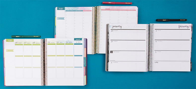
You’ve seen me do an overview of the horizontal layout as well as the vertical layout because I have both of them.
It’s almost overwhelming how many choices there are. You can make whatever planner you want and customize it however you want, which is just amazing. There are also ready-to-go, non-personalized planners that you can get if all the personalization is to much for you.
The hourly is just beautiful. I think all of Erin Condren’s stuff is pretty, but the hourly is just amazing. I don’t know if it’s because I love the covers or the changes, but I am so happy with my new planner. And very happy to play with it.
Now, before I show you my new planner. You’re going to see really quickly why I’m an idiot…..I’ll let you find it…..
I did get the hourly, with a colorful layout, and a platinum cover if you wanted to know that….
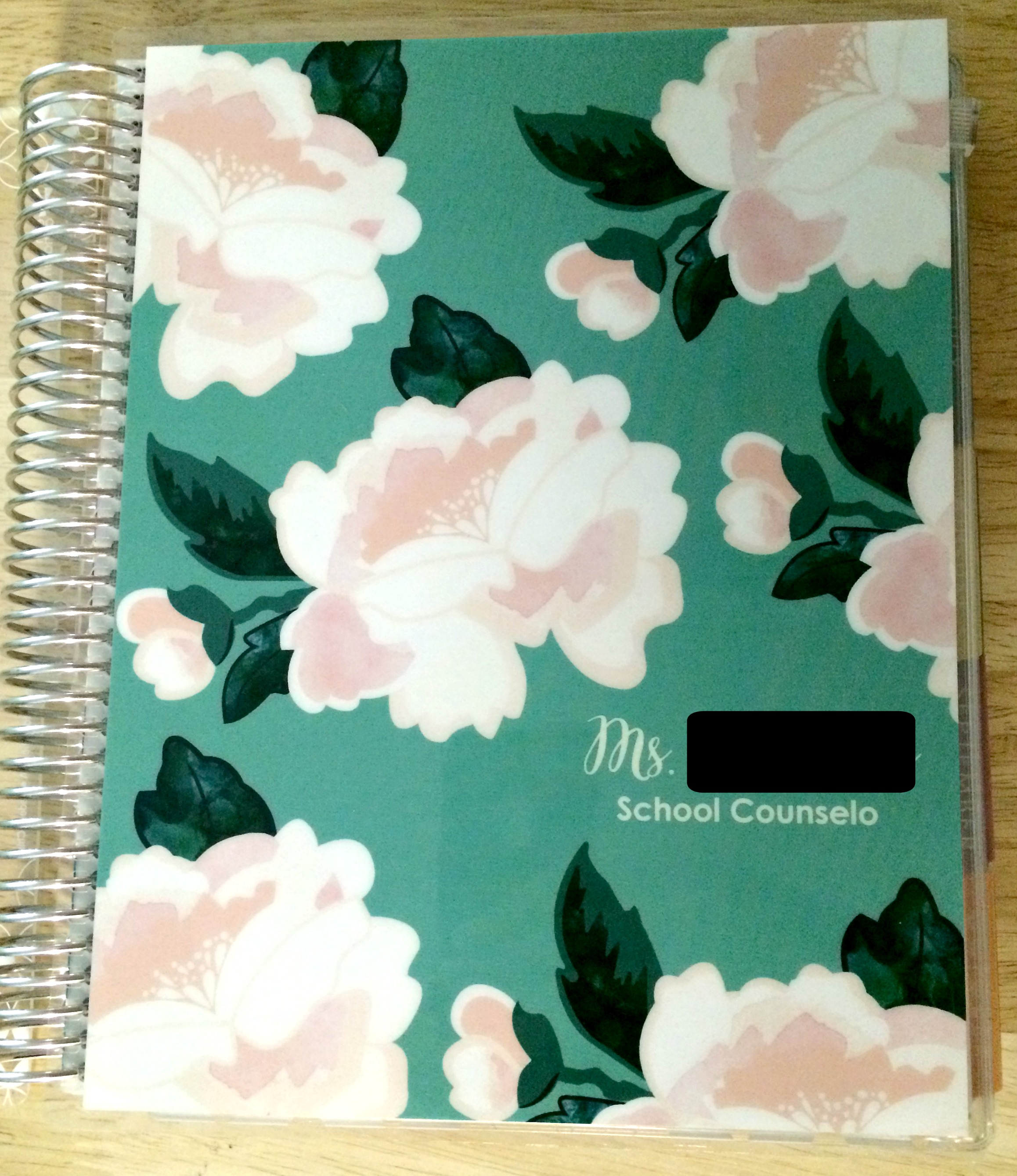
See it? You see it. Yeah….
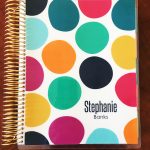
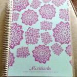
I neglected the “r” in counselor….because I’m…..an idiot, or something. Honestly it doesn’t really bother me, actually, because the rest of the cover is so beautiful. I’m sure I could get the “r” vinyl’ed onto the cover if it really bothers me, but whatever. Look at the pretty colors. This is the “blossom” cover with the “lagoon” background color. That was another update to the planners which was you can customize your cover. There are so many different patterns and you can actually change the background colors if you want to, like the original of this cover is black, but I wanted another color. And you can see a preview of your color before you buy it, so you don’t have to hope it looks good.
Inside of the front and back cover they also made improvements:
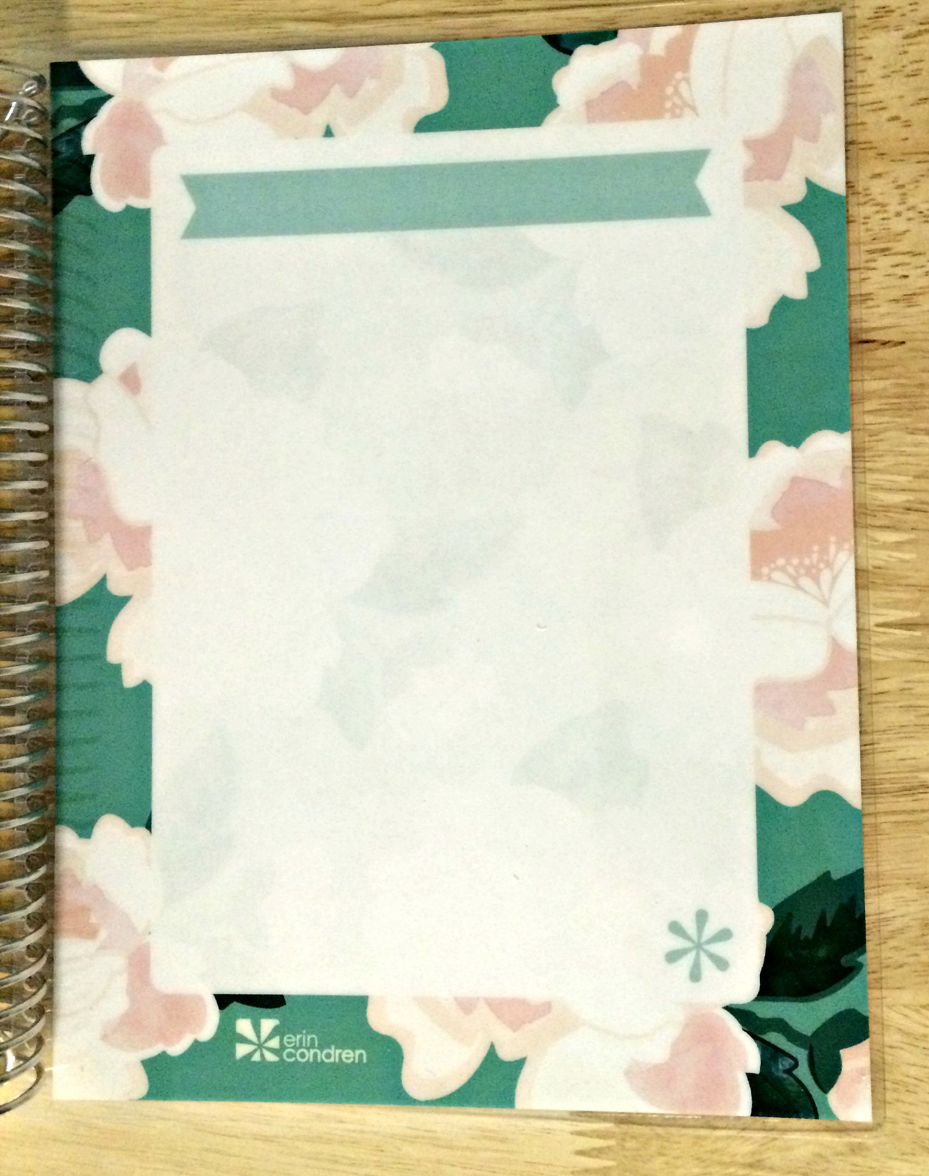
They actually put in a dashboard on each cover (the front cover has lines and the back cover doesn’t) that you can use a wet-erase marker on to make lists or reminders, anything that you want, so I’m excited about that.
So, the rest of the planner…..
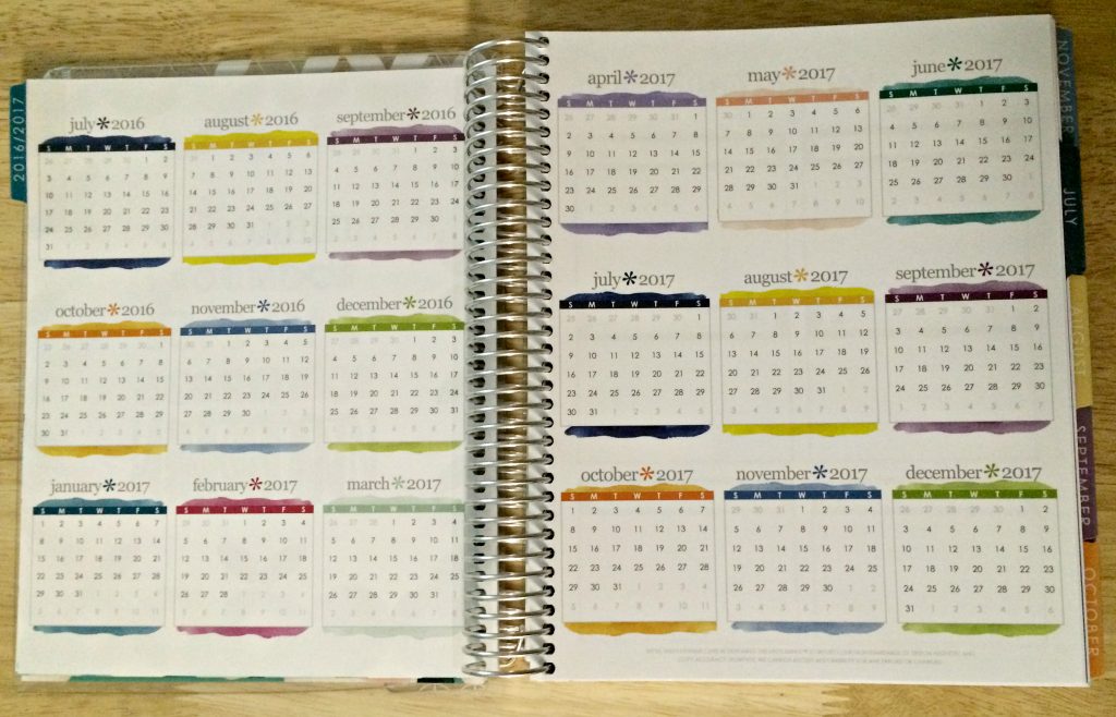
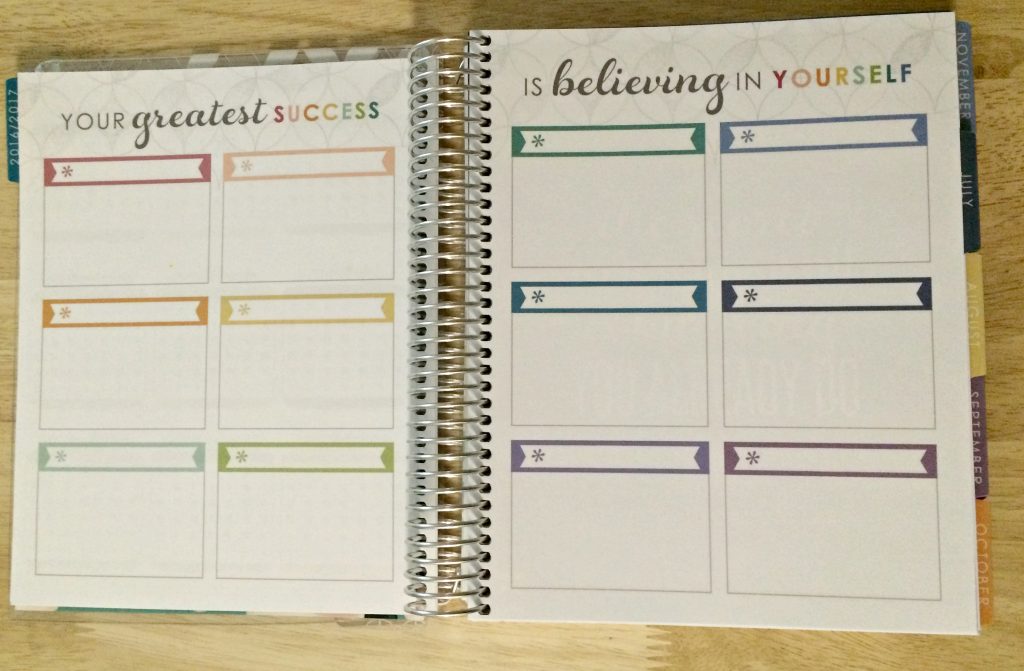
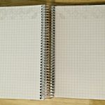
They have a layout of the year, which the always have on two pages, so you can see everything laid out easily. They also have a blank, kind of goals page or reminders page that you can use. I never know how to use this page so much. Some people use it for monthly goals, some use it for monthly tasks….I might use it for monthly events at school, so we’ll see.
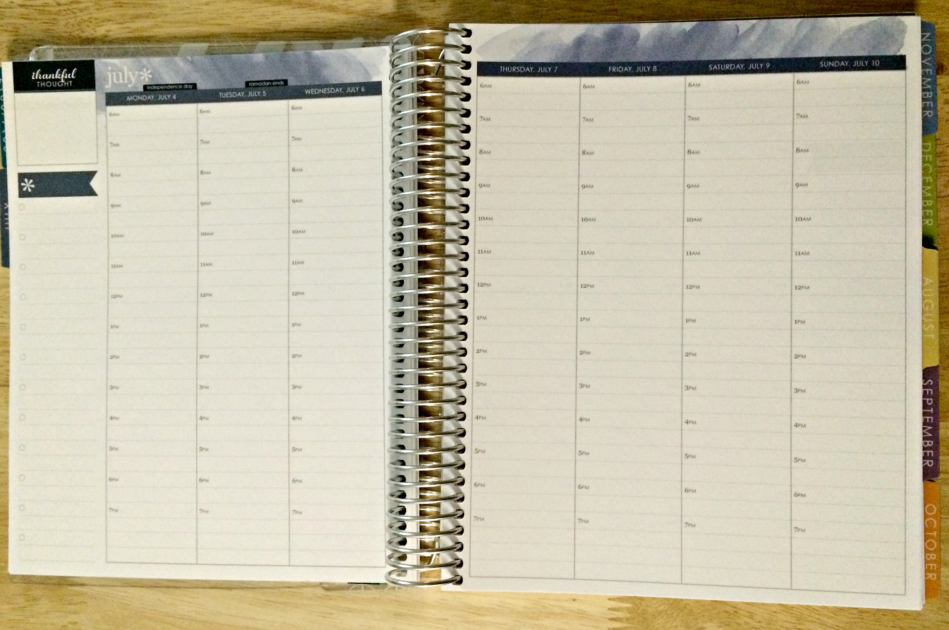
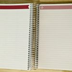
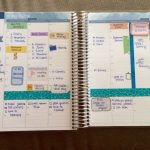
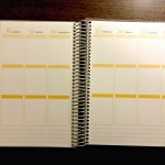
As you can see from the little slideshow above, the guts of the planner; there is so much room in it. They have the monthly pages before each month pages, which I love for laying out meetings and appointments that I have, and then they have the really colorful actual planner pages. I love the watercolor at the top, it’s so pretty and almost serene, which is what you want as a counselor. They have different colors for each month and I love how they blended months together when needed. There’s also tons of notes pages behind the planner for meeting notes, things I need to remember, etc.
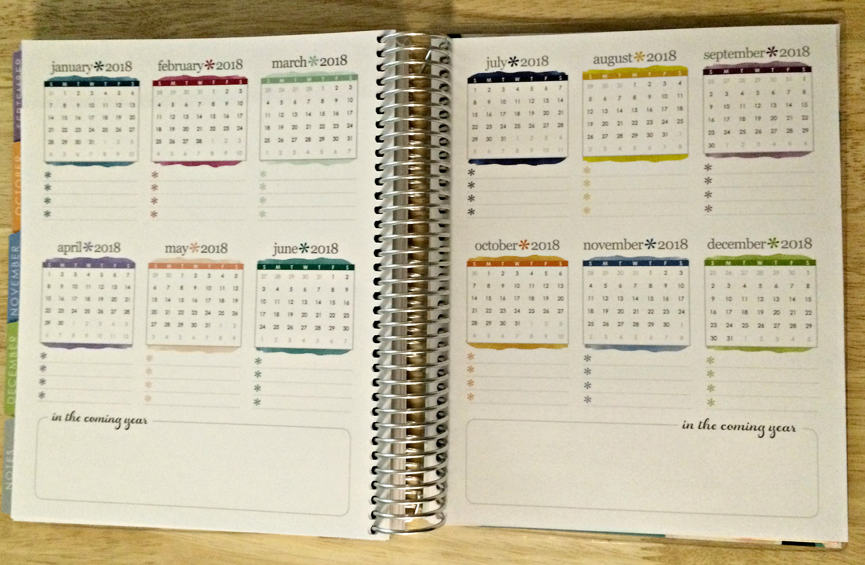
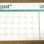
This calendar view is in the back of the planner and probably one of my favorite new additions They added a yearly outlook for the next year, so for 2018. That is so great for planning for the next school year, keeping track of birthdays, anniversaries, etc. And they added lines under each month so you can write events out that you need to plan for the next year.
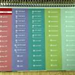
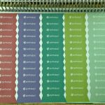
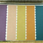
And of course I love the sticker pages. My favorite thing, though, is that they’re not all the rectangular shape that we’re used to. They made some of them into like sticker flags, which are really popular for those that like to embellish their planners. So it’s another small detail that they added which is amazing.
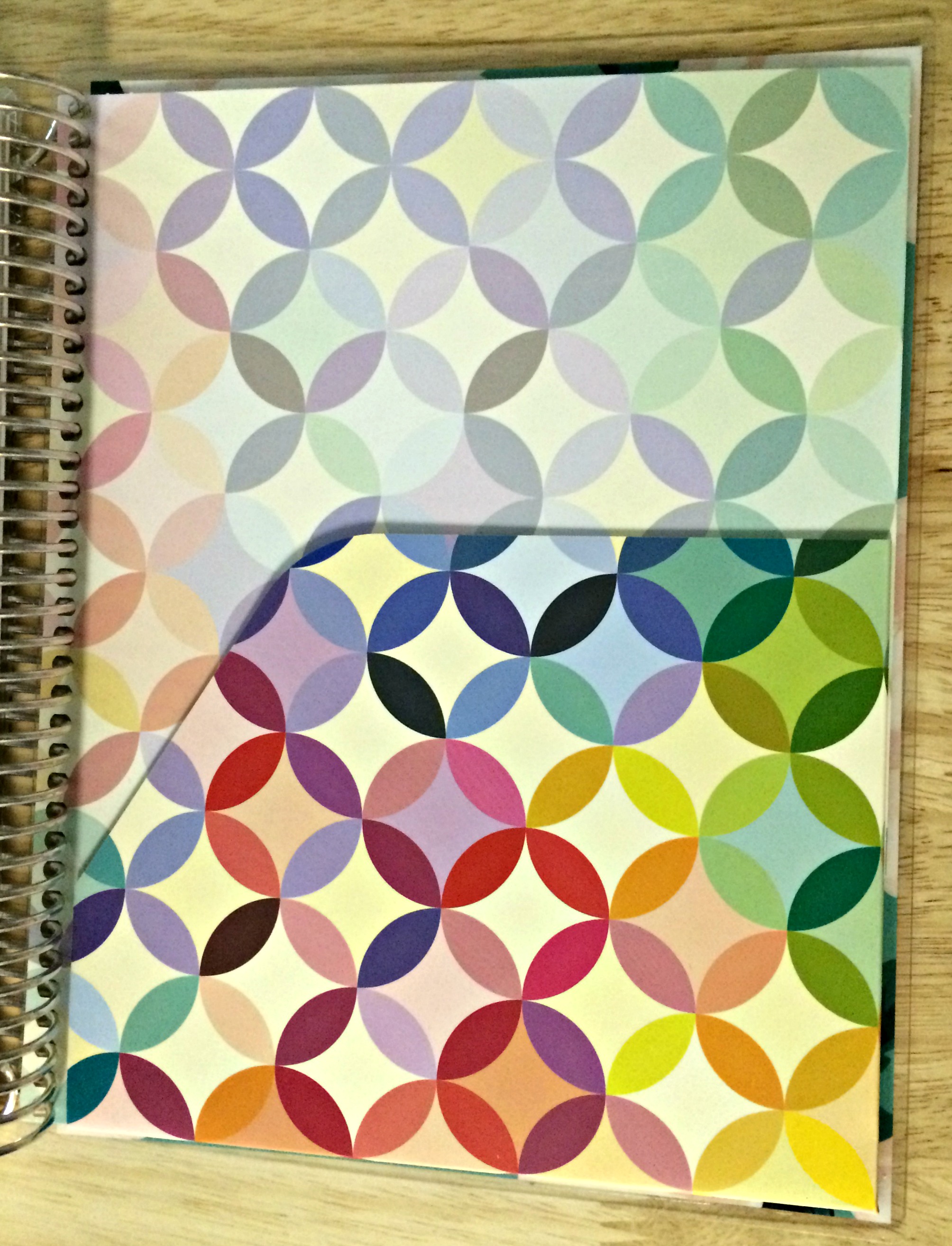
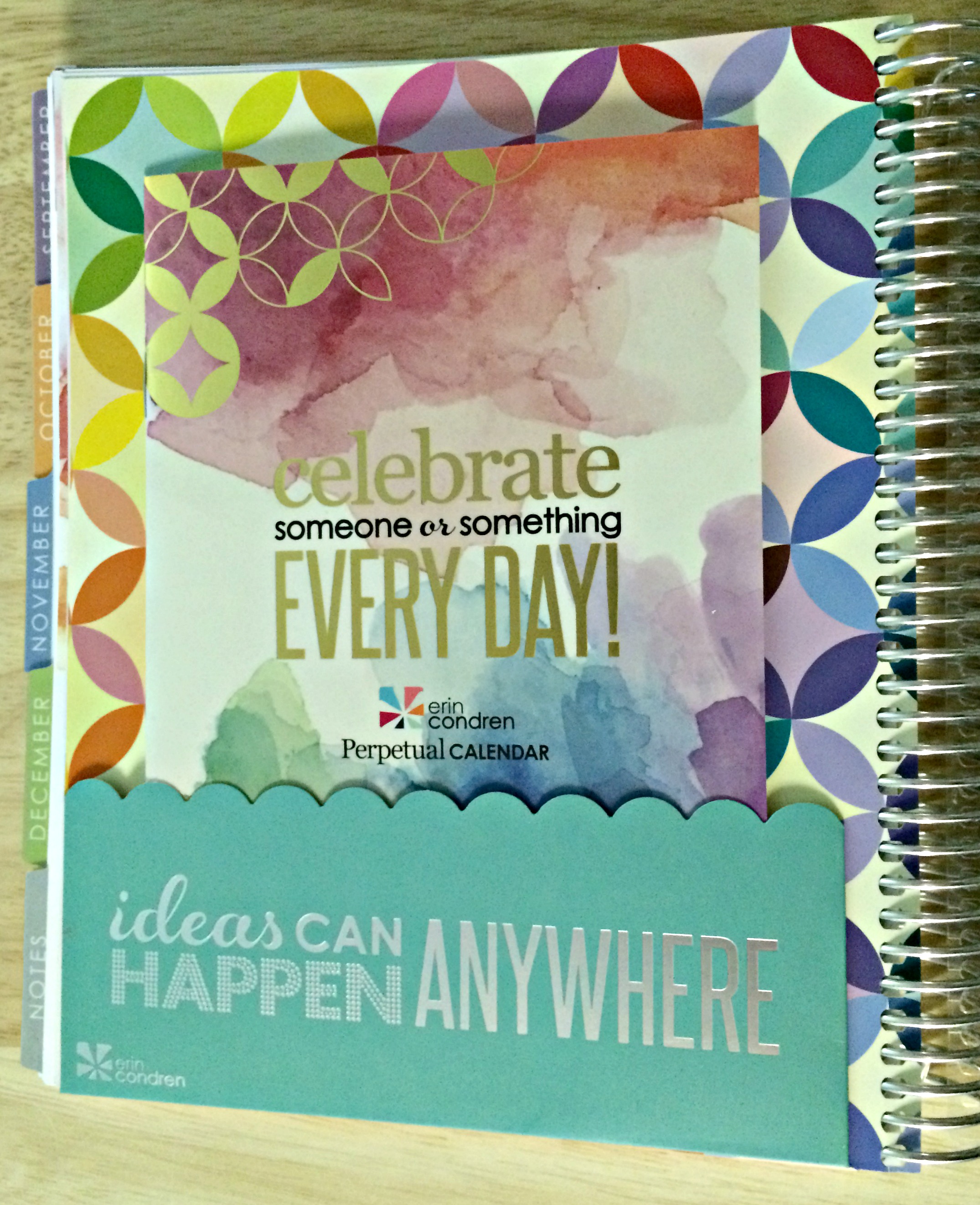
Last but not least, my other favorite update to the planners was the back folder. They’re always a folder but they updated the functionality and look at the design…. The geometric circles are so modern and pretty. The backside they also changed to have a smaller pocket and they also have their updated perpetual calendar back there, which comes with all planners.
Like I said, I will show later on (once I’ve had fun playing with it) how I plan to use this at work, so if you’re interested stay tuned for that.
If you’re in the market for a new planner and are interested in trying out an Erin Condren planner, you can get $10 off your order through this link. I promise you’ll be there awhile deciding what you want because there is just so much to choose from. You can also check back on the vertical layout and horizontal layout that I’ve posted before if the hourly doesn’t seem like it would work for you.
Let me know if you check out these planners and if you like them!


1 thought on “Erin Condren Hourly Planner!”